01 Bivariate data
So far, we have looked at one set of data and worked on that. We found the central values of the dataset, its variability and we also compared two datasets where we could. But the common thing is that we have one dataset in one graph, like the weights of 30 dogs, or the number of words of different lengths.
But in real life, it is pretty common for us to have multiple datasets describing different variables for the same dogs, or the same people. Many statistical questions also deal with potential relationships between two quantitative variables. This is called bi- variate data, which is data collected on two variables from each individual in a group.
For example, we can have weights of 30 dogs as well as their heights. We have the exam scores for all students in the class as well as the amount of time they studied for the exams.
Let’s look at the table of dog height and weight for a few dogs.
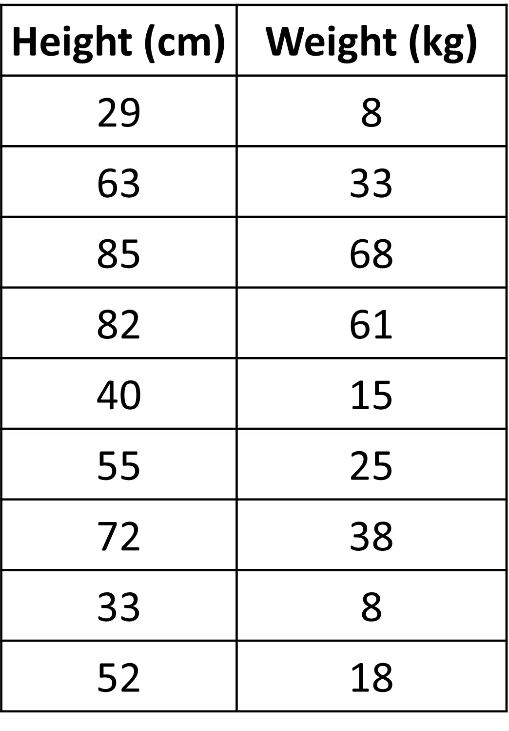
At first glance, can we see any kind of pattern in the two columns given?
Seems pretty random right?
How about the table given below?
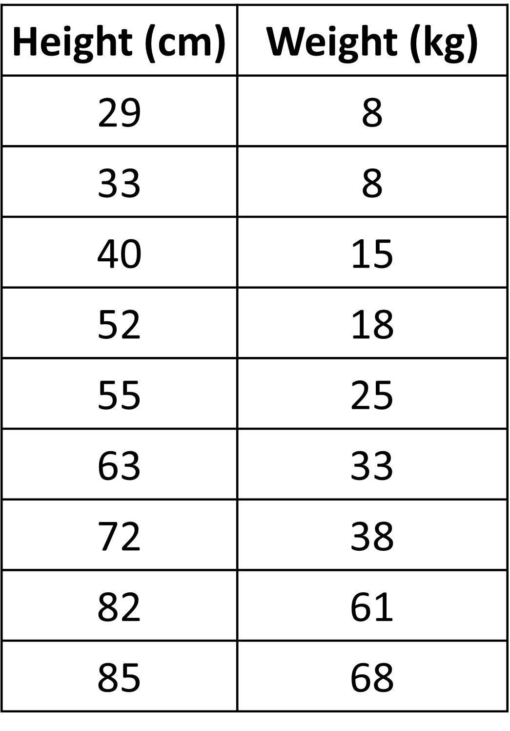
Here we see that both values increase as we go down the table. This is simply the same table ordered from before. So we can say that as the height of a dog increases, its weight also seems to increase. Seems pretty obvious right? But in some cases, two quantities might not be increasing together, they could have a completely different pattern than what is expected. This is where the idea of looking for patterns between two (or more) quantities comes into play. We will see more examples later.
Here, we said that an increase in height increased the weight. Can we also say that an increase in weight increases the height as well? Not always right? A dog might be gaining weight with too much food but does not increase in height. So, in cases like these, one is usually the response variable, like the weight in thai case and one is the explanatory variable, height in this case. Basically, changes in one effect changes in the other - one explains the response we get!
In some cases, these are also called independent and dependent variables. Explanatory is independent since it is not affected, rather it affects the response variable, which is why it’s called the dependent variable.
Keep in mind that in some cases, it could be difficult to sometimes know which is the explanatory variable and which is the response variable. For example, we have two variables - hearing loss and the volume of music. Does the high volume used depend on hearing loss? People with hearing loss would listen to music at a higher volume. Here, hearing loss is independent and high volume depends on it. Or, does hearing loss depend on the high volume? Did they get hearing loss due to high volumes? Here, high volume is independent and hearing loss depends on it. Well, it depends on what we are studying. What exactly do we want to know? Once we have the context, we can usually determine which is the independent and dependent variable.
Let’s go back to our table with dog weights and heights. We could easily arrange the data we had and observe the underlying pattern within it. But, what if there was a lot more data?
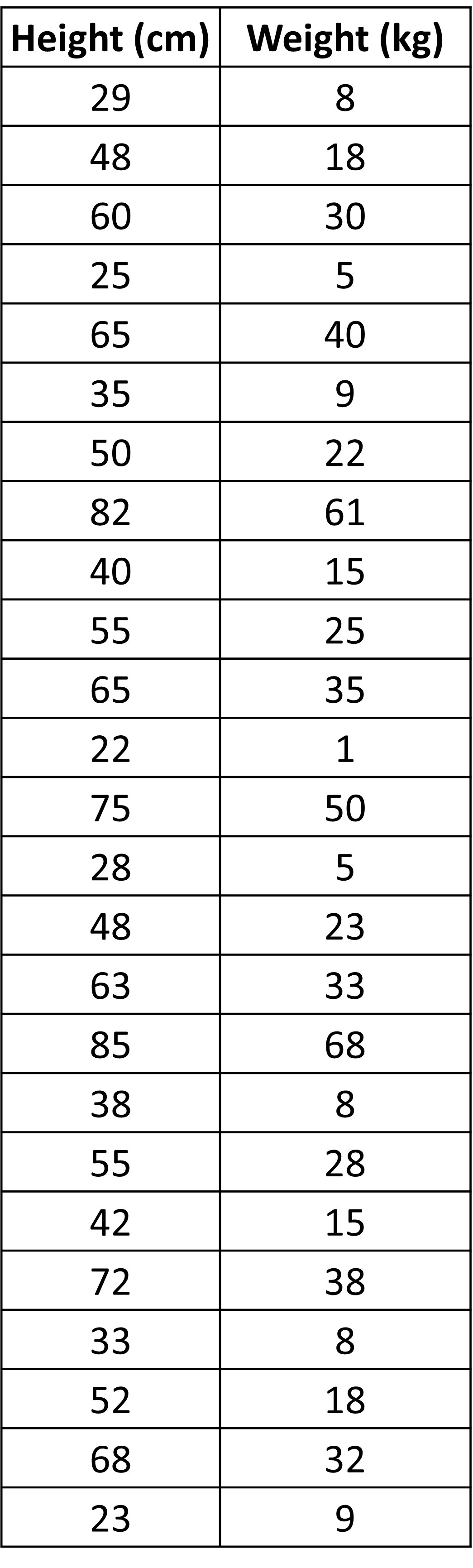
Unlike before, there is a lot more data here. Arranging them, whether in ascending or descending order will be a hassle.
So, is there a visual way we can do it? Graphs were very helpful in our previous cases, so let’s try it out again. We have two datasets, one for height and one for weight, so let’s make two graphs for them.
Let’s make two dot plots and see what they look like.
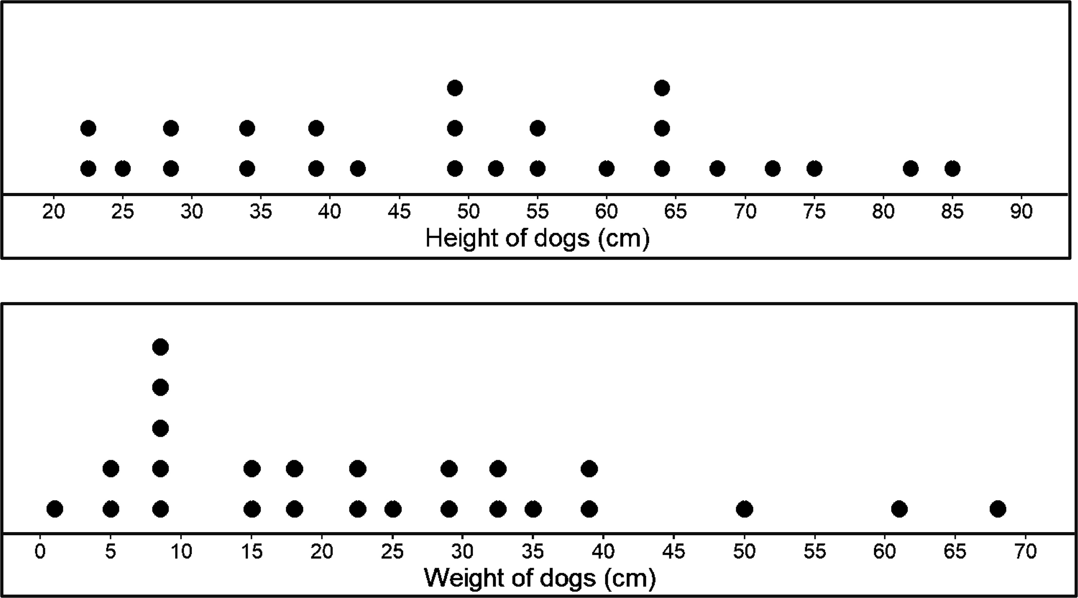
Each of the dot plots shows us the distribution of each variable - height and weight of dogs. We could have also used a histogram. But the problem is, how do two different plots help us show any relationship between the two variables we have (height and weight of dogs)? The answer is, very little. We can barely see any relationship between or association between the two variables when we make two separate plots.
The obvious solution to this is to make just one plot. We need to shift the idea of just using one axis for one variable, that we have done so far, to using two axes to represent the two variables we now have.
It’s easy enough to do, you’ve probably already done it many times in coordinate geometry and algebra already.
It is kind of like a universal rule to mark the independent variable in the x axis and the dependent variable in the y axis. We get the following graph by plotting height on the x axis and weight on the y axis.
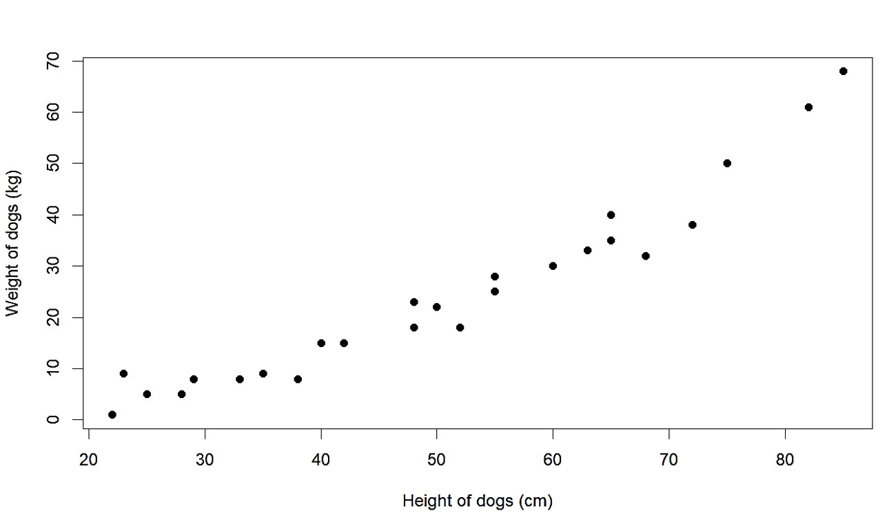
This plot, which is called a scatter plot, clearly shows us the pattern visually. The point of having both variables on the same plot is that it clearly shows us the association or relationship between the two. We can see that as the height increases, weight also increases. We could have arranged the data in the table to see if increasing one increases the other as well, but such visual ways are pretty great ways to see the pattern as well. We also do not need to go through all data and painfully rearrange them.